COVID-19 Vaccination

“How can we improve the NC Health Department’s COVID-19 vaccine webpage? How can we improve the usability for the citizens of NC? Is the current webpage serving the needs of the citizens?”

These were questions my team and I asked ourselves when tasked to conduct usability research on the mobile version of the vaccine webpage for the NC Health Department in the Spring of 2021. The simple answer was that the website was not serving the residents of North Carolina to the best of its abilities.

Ecstatic to be given the opportunity to help better the communication of vital information in such a pressing time, my team jumped into the project by starting at the beginning of the design thinking process–empathizing.  

1. What do we notice about the website design?

Upon initially looking at the mobile version of the vaccination page one thing is is obvious, it is cluttered. The website was designed for a laptop and not a smart phone. However, today everyone uses their phones to access the internet, conduct research and sign up to get their vaccination.  We kept this in mind throughout our research in order to make sure the mobile version of the website allowed users to access the essentials with ease.

2. What do others think of the website? Do they agree with us?

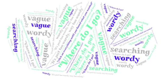
This is the major question. Of course a group of Gen Z students care about the aesthetics of a website but does the rest of the NC community have problems with it is the important question.  And more importantly, does the website serve its function well.

The only way to find out is conduct thorough research to decipher problems  that prevent users from navigating the website with ease. We developed a usability test to test the speed in which users could find information, its obvious placement, the ability to change the language and many other aspects that we felt were crucial to the website being easy to maneuver.

3. How do we identify areas of improvement based on our research? What can we determine from our research?

Several problems reoccured throughout our testing of 8 participants, ages 20 to 69. We divided these into minor, major and catastrophic issues depending on the frequency of their occurrence and their importance to the successful navigation of the website on a mobile device. During our usability test we took diligent notes on what our participants said, what they struggled with and timed many tasks in order to create a well rounded report. Below are the areas we felt users struggled with the most and ultimately limited their ability to successful find important information on the website and find out whether they are eligible to receive the vaccine.

Minor Problems

  1.  Difficulties changing between languages 
  2. Extensive navigation bar 

Major Problems

  1. The Spanish homepage translation
  2.  Hierarchy of interactivity

Catastrophic Problems

  1. Difficulties going back to a previous page 

In our presentation to the N.C. Health Department we utilized quantitative and qualitative data in order to emphasis how users felt navigating the website and the frequency users struggled with various elements.  It was vital to use not only data but direct quotes from the participants of our study. This helped capture an overview of the website and created a compelling argument for the Health Department which was successful as the design was altered shortly thereafter.