Strike

How might we meet new people in college with similar interests during the pandemic? And after?

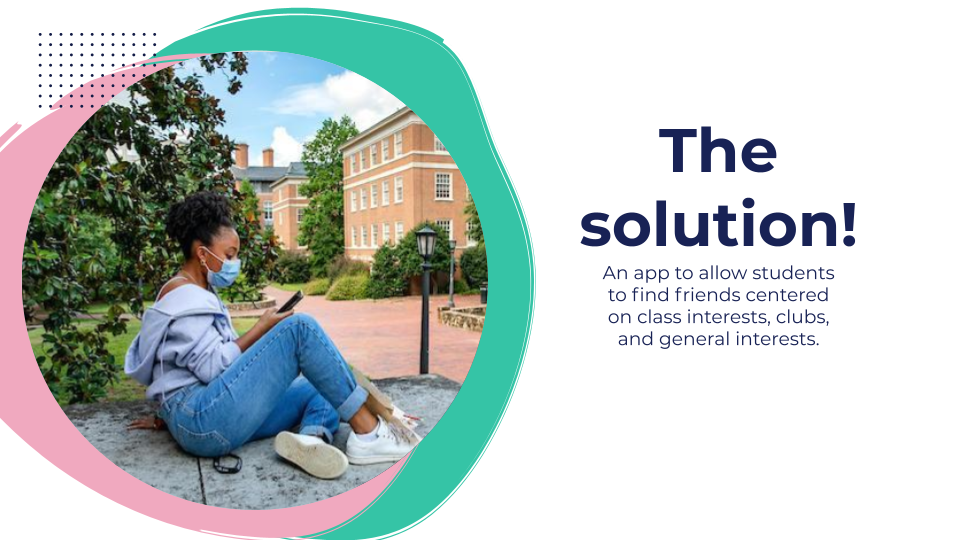
In an effort to find a way for current college students to make new friends, I made Strike. Strike strives to help college students connect virtually by highlighting things they already have in common at their schools.  

I was inspired to create Strike after seeing so many posts on various social media platforms about the struggles of new students at UNC to make friends. Thinking back to my own freshman self, I thought of how I made so many friends through the people I lived with, however, the ability to have roommates in dorms was unavailable to these students. I began thinking of other ways to meet people virtually. 

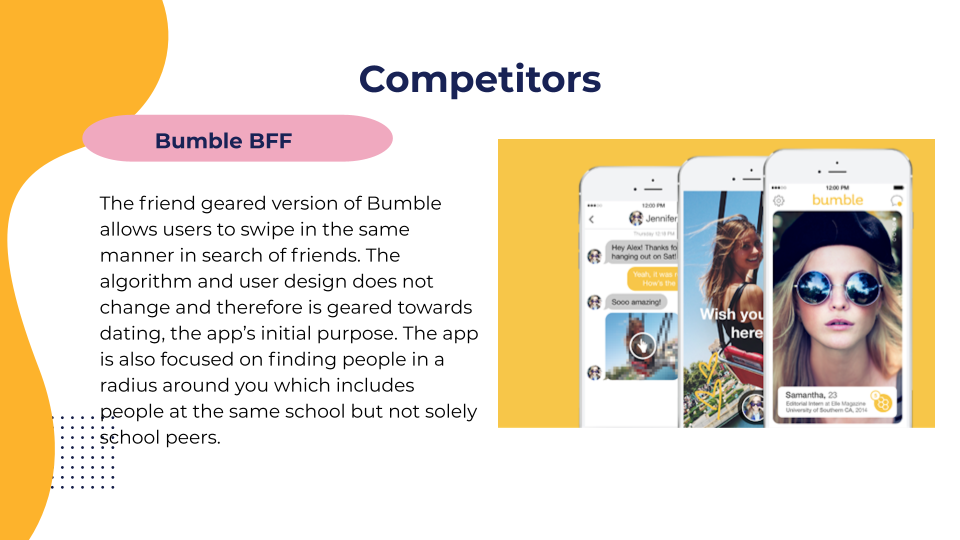
Inspired by popular dating apps, I researched and identified flaws and whitespace in the market of meeting people.  The most popular app to make new friends is Bumble BFF. However, users of the app complain about people using it to solely find roommates or lack of true compatibility that makes a lasting friendship. 

So what does make a lasting friendship?

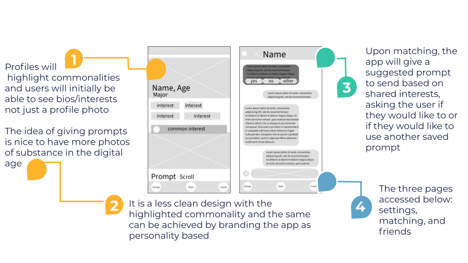
Common interests are at the core of friendships that withstand the test of time according to research. Unlike current apps such as Bumble BFF which is designed after its original dating model, Strike focuses on commonalities over appearances.  

Find initial research and proposition here


Who is using Strike?

I didn’t want solely first year students to be the target user of Strike. Throughout college students are making new friends and expanding their social circles. I helped focus on WHO the user is by developing two personas to guide me in the development of the user design.


The personas of Holly and Abigail represent the perspectives of a freshman and a junior. The personas outline their wants and needs from in the app which helped me keep the user in mind when I began creating  wireframes.  I asked myself “How can I best serve Holly and Abigail?”

I began developing the user design by sketching low fidelity wireframes.  I tested the design and usability of Strike amongst college students at UNC to gauge interest in the app and listen for opportunities to improve its design.

 The feedback I received led me to make the app exclusive to users of colleges, requiring new users to login with their college email.  Another insight involved predetermined message prompts and the ability for users to select one based on shared interests or a personalized one they can use with everyone. These aspects became staples of the final design and valuable aspects of Strike.

After conducting testing on the low fidelity wireframes, I began to develop high fidelity wireframes.  

I developed and reviewed the high fidelity wireframes and I outlined a journey map for one of the personas I developed

By doing this I was able to map out ways users would use the app in order to identify any missing aspects or flaws in the overall usability. Journey mapping allowed be to ensure that the overall experience met Holly’s goals. 

GOALS:

  • Meet people with similar interests (potentially the same major)
  • Join a new club with someone
  • Make lasting friendships


Finally, I began creating the design in Adobe XD.  I chose a color pallet focused on yellow and light blue in order to bring vibrancy to the design as well as a sense of calm.  I wanted the colors to be soothing and optimistic, similarly to the mentality one should have when meeting new people. 

I chose a light gray, navy and white as the secondary colors for fonts and other details.  While black is commonly a secondary color, I felt navy brought a level of sophistication and complimented the light blue and yellow well.

The final interactive design can be found using the link below. 

I developed a slide deck to pitch my final product along with the value proposition.  Below is the full slide deck outlining my project and the thought process behind the development of Strike.